Introducing... Our New Logo
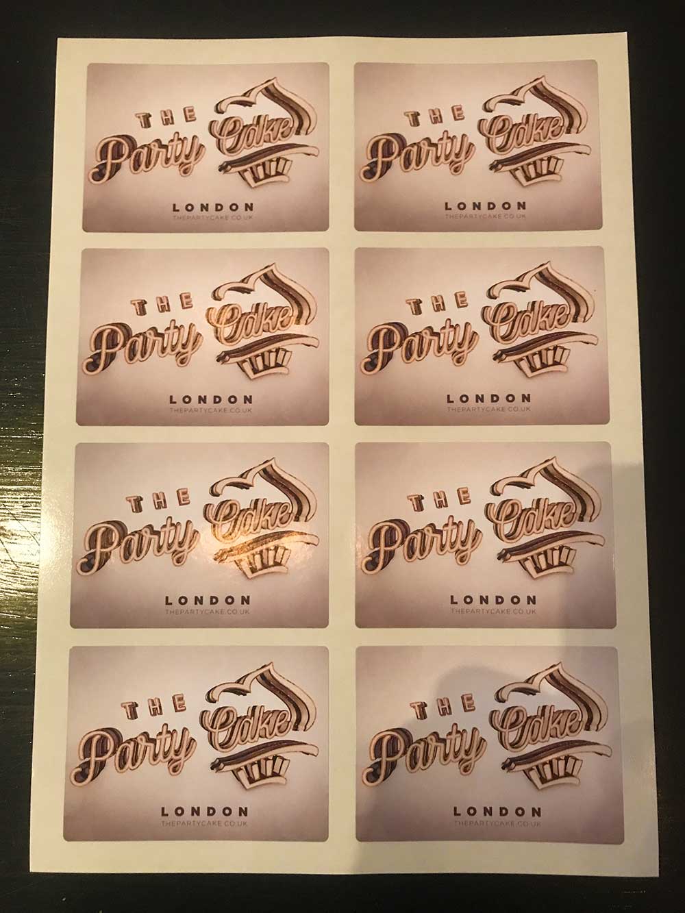
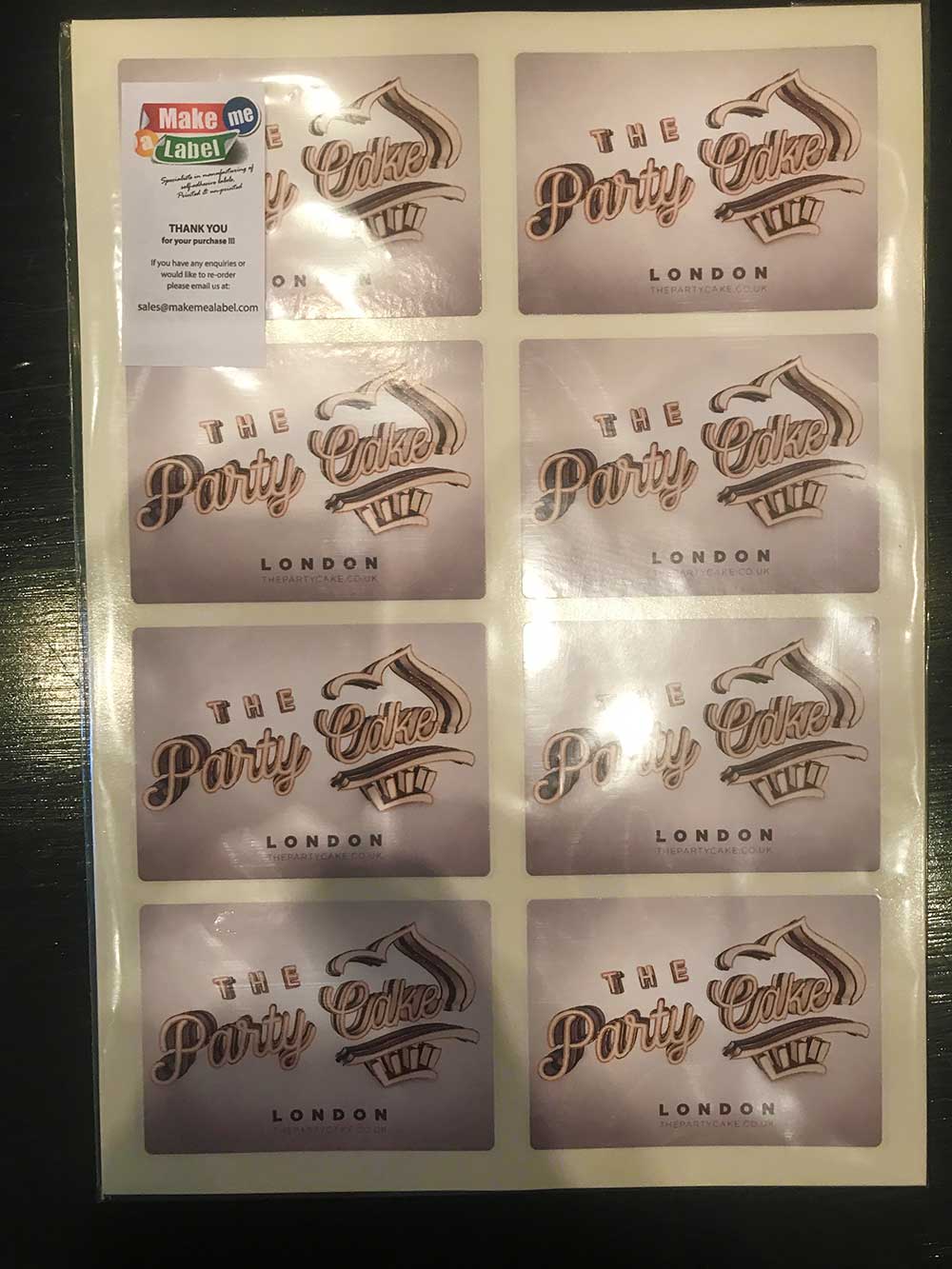
I've been meaning to update to a slightly more corporate/professional looking logo for some time now.
But it wasn't until we started stocking and shipping HealthKick® Appliances directly (plug 😁) that I realised the old logo just didn't print well in plain black. The 3D effect didn't work & removing that just made it look cheap. It looked especially bad on thermally printed shipping labels.
So here we are... Our New Logo. Simple & Square with the slightest hint of the Orient.


